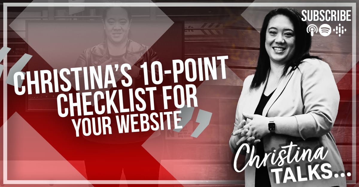
Christina’s 10-Point Checklist for YOUR Website
20 Jun 2022

2022 has been quite hectic for Christina but exciting things are starting to happen now so Christina wanted to come back with a renewed focus to share her knowledge and expertise as well as what she has learnt from the great people she is surrounding herself with at the moment.
When people first start in business, their website isn’t always their first focus. They can mistakenly think it’s something that will be expensive and time-consuming to organise but this doesn’t have to be the case at all. Listen in to this episode to hear Christina’s 10-Point Marketing Website Checklist she created to help score her clients websites.
KEY TAKEAWAYS
When businesses are first starting, they just need something that will help them be found on google, will help reassure potential clients and somewhere that can generate leads. You can just think of it as a shop front but even then you should be making it work to help generate something for your business.
A call to action is one of the first things Christina looks for on a website. The website should take her on a journey, with every click she is building trust with that brand. The call to action that is created should be the most logical next step which also engages them.
When reading the website content, the individual needs to feel like they are being spoken to personally. Think about the language you are using on your website and how you can make the user feel like it’s aimed directly at them as an individual.
News or blog pages are a great way to ensure people keep coming back to your website. Ideally you want to try and get people to come back every two weeks. This is a good regularity to have, it’s enough for google to pick it up without overwhelming your potential customers. It’s also a good tool to use and share on social media too.
Make sure there is a lead generation capture on the website, for example a blueprint, guide, poster, quiz or even filling in a form to receive a freebie.
If you can get data from potential customers, try and mix up the communication. For example, sometimes send an email, sometimes send a text message.
People love sharing. On your high value pieces of content, include a share button!
Always include your social media accounts on your website banner.
Make sure your website is mobile friendly, always check it.
Have a visible phone number, make it easy to find and also make it ‘click to call’. If people find it difficult to contact you then it creates a negative start to their interaction with you.
Include testimonials on your site. You don’t need a specific section or page necessarily, you can simply scatter them through the web pages.
One of the best ways to communicate your brand on your website is simply through images. The more visual your site is the easier it is for people to engage with the content that is there.
Consider the variety of media you use on your website, can you add audio or video to make it more interesting and engaging to your potential clients?
